What is Brickstream?
Brickstream is a complementary experience on LEGO.com exploring the mix of franchise and UGC content from LEGO Life in an endless and intuitive feed on all devices.
My role on Project Brickstream was a hybrid between UX, design and product management, I prefer the term Senior Product Designer.
Common Development Problems
I enjoy building products people love but just as important to me is making sure the team that builds them is passionate, inspired and happy throughout the development. Most digital projects at LEGO left the teams exhausted and unmotivated and the root cause of some of the problems were as follows:
- Client having to specify all features upfront to internal agency account managers. In the extremely unpredictable world of digital this naturally caused massive scope creep, conflict and delays.
- The development teams focus was executing user stories not meeting user needs.
- No clear vision of what needs the product was solving for users.
These are very common problems in digital development and have been pain points for most companies and the best solution I’ve come across is adopting a more lean approach.
I don’t believe any modern design process needs to be rigidly followed and can be adopted for each unique organisation setup like LEGO with its client / internal agency setup. I have cherry picked key LEAN UX / Design thinking concepts that helped us overcome workflow problems and is by no means all we did.
How LEAN UX Fixed Bad Client Briefs
Our client briefs moved away from features towards user outcomes giving the core team the challenge of solving for outcomes not building features. We also moved away from user stories and worked together building hypotheses that addressed these outcomes.

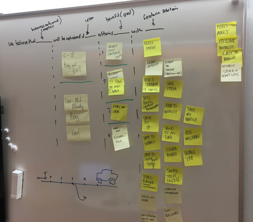
We triaged ideas and assumptions using a variation of LEAN Canvas
We used the following format for our hypotheses:
We believe [Solution ideas] will result in [user benefits] for [users & Customers] we will know we have succeeded when [Business Outcomes]
We had hundreds of hypotheses and a very rough idea of what the end-to-end experience needed to be “A place where kids can see all things LEGO”. We needed a clear way to communicate to the core team the scope and vision for the experience.
Setting a clear product vision
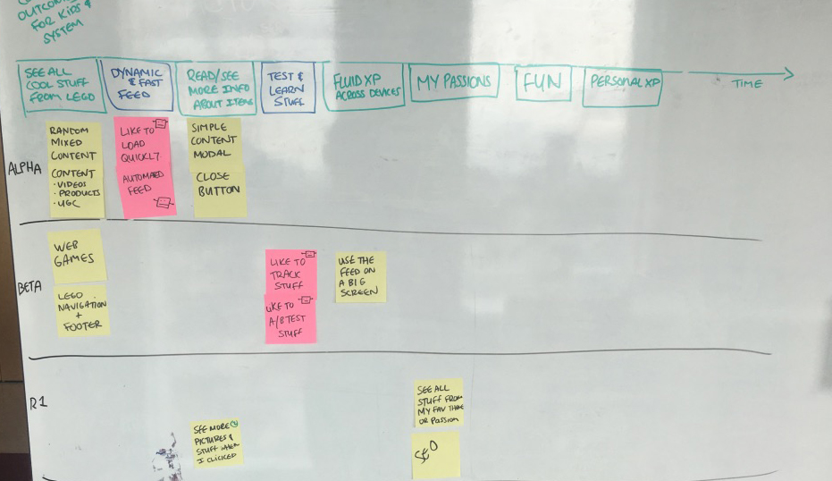
We facilitated a User Story Mapping workshop to flesh out our minimum viable solutions (I prefer this term to MVP because our early versions sometimes aint even products yet). This allowed us to test core concepts before taking on extra enhancement features. Historically everything was pretty much built up front delaying projects for months. The first MVS was launched live to kids in less than a month and on time, this was a first for LEGO and got everyone really excited and energised.

Early version of the User Story Map helping the team see the big picture.
Highlights of the rest of the project
Getting people to build less is actually harder than it sounds and its very rewarding when you put it in front of real people.
Originally our Alpha started getting bloated during the user story mapping exercise and we challenge everyone to cut it to its core. The feed had mixed content in it so we had to tell kids via icons what content was a game, video or product or did we? Could we leave out icons and see how kids reacted? It would mean less work and we would figure out if kids struggled. Turns out kids didn’t care and were happy to just click on anything that looked interesting. This was the first major aha moment for the team as our assumption was proven false and we didn’t waste time building something no one wanted.